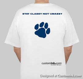
Okay, now on to the T-shirts. I have decided to use customink.com for the shirts and below I have posted the first draft of the blog t-shirts. I know that they are very simple, but I want to able able to keep the price per shirt at $10. ($12 max, I promise) Let me know if you have any suggestions, ideas, tips, critiques, or anything. I want the shirts to be appealing to anyone. There is a good chance these will not be the final product. I want your opinions because these shirts are for YOU.


dude, i hate during the weekend when i'm walking home late at night after leaving a party by myself and a girl or two girls are in front of me because i think they feel i'm following them when all i want to do is get back to my room and pass out. usually i just take an alternate way or something.
ReplyDeleteYeah, I know exactly what you mean.
ReplyDeleteHow about UNH dark gray and blue?
ReplyDelete~"Mr. Wolf"
A dark gray shirt with the blue lettering looks much better. Good call!
ReplyDeleteI like the UNH on the front. Maybe put University of Nonsensical Happenings in smaller lettering underneath? And then Stay Classy, not Umassy on the back?
ReplyDeleteThanks, for the feedback so far. I'll add new shirts as the ideas come in.
ReplyDeleteI know it might be difficult, but I like the design you have on the top of the blog, with the UMass font style.
ReplyDeleteA wildcat eating a minuteman would be awesome too. Just hire one of the art students to draw it.
ReplyDeletewhat happened to the paw on the back of the grey shirt?
ReplyDeleteI love those ideas, but adding custom graphics like doubles the price, and the quality isn't there. The first one I did was the banner from the blog but it was too pixilated even if I cropped or enlarged the picture....
ReplyDeleteAlso, I would add the paw to the gray shirts too, I just wanted to throw up as many different variations. Thanks!
i think a good color scheme that i saw in the school store was a dark navy shirt with white lettering.
ReplyDeleteBuy white t-shirts, use a stencil, and paint the designs on, lettering too. Or buy the white t-shirt with the lettering and stencil on a design to keep costs down.
ReplyDeleteI want Stay Classy,
Not Umassy! big on the back. with a unhblog.com on the left side of the chest. preferably on a collared shirt.
The blue shirts do look nice, but gray is cheaper.
ReplyDeleteSorry, stenciling aint my style, plus it doesn't look as nice.
no collared shirts, they are too pricy. And URL's on t-shirts looks bad. Trust me, I've done my research.
I like the blue shirt ideal? how much more is it? I wouldn't mind paying an extra dollar or two for a nice looking blue one
ReplyDeleteyea, blue sounds good to me, can you post a preview?
ReplyDeleteOkay, blue and gray seem like the favorites. I'll put them up tomorrow and let you guys vote.
ReplyDelete